Spring 2000
Civic Design: Involving Readers at Every Turn
By Pat Ford
Staff Writer, Pew Center
It’s shorter, it’s newsier and it seeks to involve readers at every turn of the page.
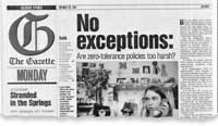
The striking redesign of The Gazette in Colorado Springs is still being tweaked, but its goals and tools are part of a national trend toward what might be called “civic design.”
The Gazette and other newspapers around the country are using fact boxes, check lists, issues maps, reader rails, grids and other features that work to involve readers more in stories and help them navigate the news more quickly.
Whether as part of a total redesign, or in individual pages and sections within the existing design, papers are increasing leaning on these features in their efforts to make news more accessible and engage readers more actively.

In the case of The Gazette, the paper took the radical step of eliminating its traditional flag with its signature background of Pike’s Peak in favor of a giant, brown “G” in Old English script.
Readers say they still pine for the mountain range.
But Editor Terri Fleming says she is sure readers eventually will forget their objections as they learn to love the shorter, more straightforward stories and helpful graphics that are the heart of what they asked for in reader surveys and focus groups. Condensing the former flag into a single “G,” for instance, allows the paper to put more news higher on the page.
“Readers were very clear and to a person they said, ‘You are a primary source of news and information. That is what we want from you first,’ ” says Fleming. “Our goal is to put more information into more hands more quickly.”
To reach that goal, The Gazette is using elements developed in its civic journalism work: boxes that refer readers to additional sources of information, check lists of personal actions, opportunities to contact reporters and editors. “Layering and links” are what Gazette designer Amanda Rohrer calls it.
“What we discovered after working with many newspapers is that the ones that were most successful at connecting with readers were those where graphics people, photographers, reporters and editors all work together to answer the question: ‘How can we help readers the most?'” says Pegie Stark Adam, a designer on The Poynter Institute’s faculty.
Adam teaches that method under WED, the acronym for writing-editing-design. “When I work with WED in newsrooms, civic journalism is what we’re doing in those pages,” says Adam. “I’m never thinking ‘Pretty page.’ I’m thinking ‘What’s the content? How are we going to get the reader involved in this story? How do we get them engaged? How do we get them to respond?’ ”
New Routines
Those questions are very much part of the daily routine for The Gazette’s staff. With the old design, they couldn’t always play stories in a way that answered those questions appropriately, says Fleming.
The new design has addressed that problem by freeing reporters from the routine of telling every story in a narrative form, Rohrer says.
“Each story will be presented in the best way for that story,” says Rohrer. “A lot are meant to be long narratives. A lot are better told in a different way. Maybe that’s a 10-inch story, then a box, then a list. We need to present that information in the way that makes sense for that information.”
In the first redesigned paper, for instance, a relatively short lead story about traffic in Colorado Springs was accompanied by a map of choke points and a box of driving tips. A “Focus” page on Colorado’s congressional delegation had a grid of profiles and a rail, or narrow column, of key votes.
The net effect, editors hope, is a paper that is easier to get through in a shorter amount of time.
Similar goals are behind the new design of The Arizona Republic. Designer Keira Nothaft says The Republic had two goals: to establish itself as a leader in the community and to be easier for readers to navigate and understand. To meet both objectives, the new design uses civic tools.
“There is something in every section meant to connect with our readers,” says Nothaft. The prime example is a letter to readers, written by a staff member, every day on A-2. The content varies. “It might explain why the Sunday paper is so much larger than Monday’s,” says Nothaft. “It might be a behind-the-scenes analysis of how we got a major story.”
The rail that runs the length of the front page, for instance, contains a summary of stories appearing inside for readers who can’t read the entire paper. And story lengths are flexible.
Is this bad news for reporters, who would like more people to read their prose? Not necessarily.
Nothaft says the paper has left lots of room for long stories. What The Republic tried to address, she says, is “the murky middle, where reporters don’t think they’re doing their job unless they write 18 inches, even though the story doesn’t really need to be that long.”
Being Useful
It doesn’t take a total redesign to incorporate civic design elements. At the St. Louis Post-Dispatch, editor Robert Duffy devised a Sunday section called “Imagine St. Louis,” that draws heavily on interactive tools – six months after the paper was redesigned.
By incorporating such things as issues maps and easy-to-follow lists, his section manages to be both utilitarian and attractive. He says that is simply a reflection of the adage that “form follows function.”
Lists, maps and boxes are good, strong design elements, “but they are creatures of content,” says Duffy. “They are driven by what we thought was important to give the reader.”
In short, they work. Readers like them. And that’s why they are turning up more often.
Even The Washington Post, will, on occasion, employ civic design. A wrap-up of last year’s Maryland legislative session, for instance, used a box headlined “How Annapolis Has Affected You” to explain the impact of the legislature’s action.
“I look around and see it blooming,” says Tom Warhover, North Carolina editor of The Virginian-Pilot. “The trend lines are to be more responsive to readers, period.
“It’s a small step between being more responsive to readers and treating readers like citizens. I mean, it’s a large step conceptually but not in terms of design. Design you can play with without so many risks. You don’t have to say, ‘We’re in favor of promoting a healthy democracy.’ It can be the tail wagging that dog.”
At papers like The Virginian-Pilot, new civic design features are being invented all the time.

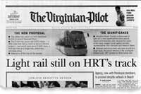
Poynter’s Adam says she often uses The Virginian-Pilot as a model of good design. Adam is a big believer in fact boxes to highlight the most important information in a story, and she says The Virginian-Pilot has made them an art form.
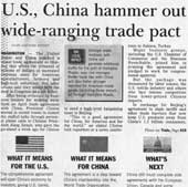
In fact, editors there have an affectionate term for them: WIMTY boxes, for “What It Means To You.”
“On every single story,” she says, “they ask the question, ‘What does this mean to you?’ The fact boxes don’t necessarily carry that headline, but they answer that underlying question.”

A typical Virginian-Pilot front page will hold at least one box containing a signature green square that reads “The Local Impact.” It brings any story straight down to the community level. “Local impact” boxes are liberally spread throughout the paper, along with other boxes: “What’s Next,” they may say, or “Results,” “Case,” or simply “Fact Box.”
And fact boxes are just the beginning. Front-page photos can spread across six columns with text superimposed over them. Instead of a traditional photograph, the main visual element might be a graphic or a map or a timeline or a group of individual photos laid into a box and interspersed with text – whatever will work best to engage readers. Even the headlines are carefully crafted to draw in readers, Warhover says.
“Graphics, art, headlines, story, they are all part and parcel of the thing we call ‘story.’ They are not ornaments,” he says. “When you think about it – not how a journalist thinks but how someone coming to the newspaper thinks – they’re not thinking, ‘Oh, this is a story and this headline is something else.’ ”
Warhover says these strong design elements reflect not only the paper’s desire to serve readers, but also to serve a larger goal. “We like to get beyond readers as consumers,” says Warhover. “(We ask) is this answering the questions of citizens or people we aspire to be citizens?”
